Performance
N/A
Requires PageSpeed API Key
Website Audit for Mackie Plumbing
🚦 Executive Summary
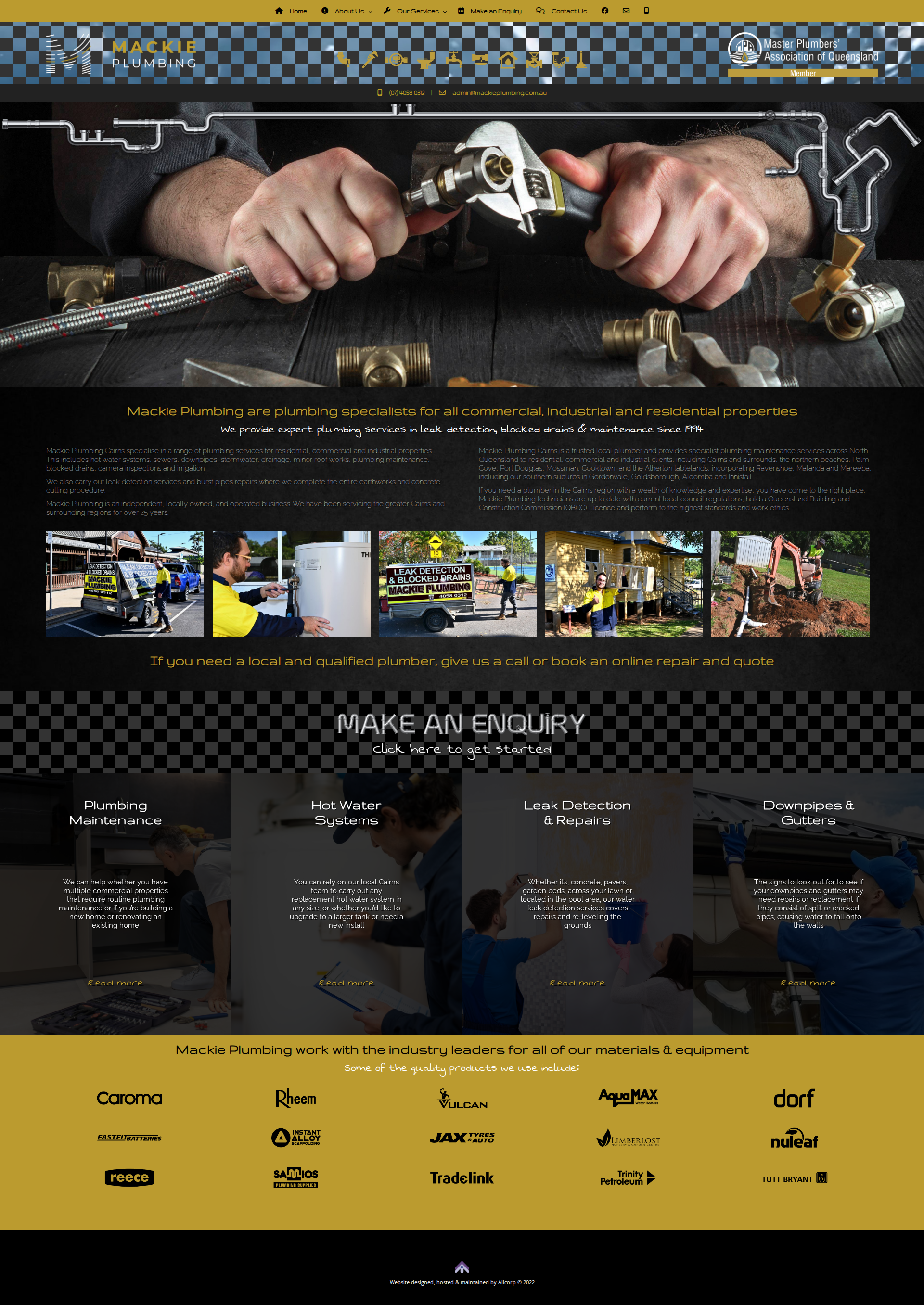
Your business clearly has a strong legacy and solid reputation (operating since 1974), but your website design is stuck in the past. While you have excellent trust signals like the Master Plumbers logo and real photos of your team, the dark visual theme, difficult-to-read fonts, and lack of clear "Call to Action" buttons are likely costing you leads. The site validates you are a real business, but it doesn't effectively drive the customer to pick up the phone.
✅ What You're Doing Well
Industry Authority: Placing the Master Plumbers' Association of Queensland logo in the header is a massive trust win. It immediately separates you from the cowboys.
Real Imagery: The strip of photos showing your branded vans, uniformed staff, and heavy machinery is excellent. Customers want to see who is coming to their house, not generic stock photos.
Service Clarity: You have clearly defined your four main pillars (Maintenance, Hot Water, Leak Detection, Gutters). This helps customers navigate quickly.
Brand Association: The footer displaying logos of suppliers like Rheem, Caroma, and Reece shows you use quality materials, which reinforces quality workmanship.
⚠️ High-Priority Fixes (The "Money Leaks")
Readability & Accessibility Issues: The grey text on the black background is very hard to read, and the "handwritten" script font used for sub-headers and "Read more" links is difficult to decipher. If they can't read it, they won't buy it.
Weak Call-to-Action (CTA): You don't have prominent buttons. The phone number `(07) 4058 0312` is tucked away in a small font under the logo.
* *Fix:* You need a big, bright (perhaps yellow/gold) button in the top right corner that says "CALL NOW" or "GET A QUOTE".
Dated Design Elements: The "MAKE AN ENQUIRY" text with the shiny/bevel effect looks like it’s from the early 2000s. It makes the business look behind the times, which can subconsciously make customers worry your technology/methods are also outdated.
Buried Contact Info: In the middle section, you say "give us a call," but there is no button there to actually initiate the call. On mobile, this forces a user to memorize the number or scroll back to the top.
💡 Growth Opportunities
Review Widget: I see you have been around since 1974, but I don't see a live feed of your Google Reviews. Embed a 5-star review widget on the homepage to leverage social proof.
Specific Service Pages: The text mentions you service Cairns, Gordonvale, Goldsborough, etc. You should create specific landing pages for these suburbs (e.g., "Plumber Gordonvale") to dominate local SEO results.
Mobile Sticky Header: Ensure that when a user scrolls down on their phone, the "Call Now" button sticks to the top or bottom of the screen so it's always one tap away.
📱 Mobile & Trust Score
Mobile-Friendly: Needs Improvement. While the layout likely stacks, the script fonts and low-contrast text (grey on black) will be nearly invisible on a mobile screen in direct sunlight (common for people calling a plumber during an emergency).
Trust Factor: Medium-High. The content (MPAQ logo, real photos, years in business) is high trust, but the outdated web design lowers the perceived professionalism slightly.
The Bottom Line: You look like a great plumbing company with a weak website. A design refresh that focuses on readability (black text on white background) and big buttons will significantly increase your enquiry rate.